The Challenge & Goals
It sounds strange to say they were a great partner, only because they just felt like part of the team.
We are no stranger to the world of enterprise cloud services/architecture. Some would even say that it’s sort of our niche. So when we were approached by CTERA to create an entirely new website, we were thrilled. CTERA is a company who is not only innovative but also tangible. Being able to work remotely from the cloud with the speed and security of working from your own personal hard drive at an enterprise scale. Pretty amazing.
Working with CTERA was an exercise in communicating a variety of enterprise services and products to a select user base of IT executives and professionals. Showcasing the benefits of their services in addition to creating opportunities to collect information and make conversions was one of our biggest goals.
The CTERA marketing team had incredible insight and experience. Combing our expertise in the Web with their expertise with their products, services, and industry yielded sophisticated results. It was an awesome partnership. In addition to having great insight they also came with a fresh set of brand elements to work from. It was our job to take these brand elements and expand upon them into the form of a fully functional website.
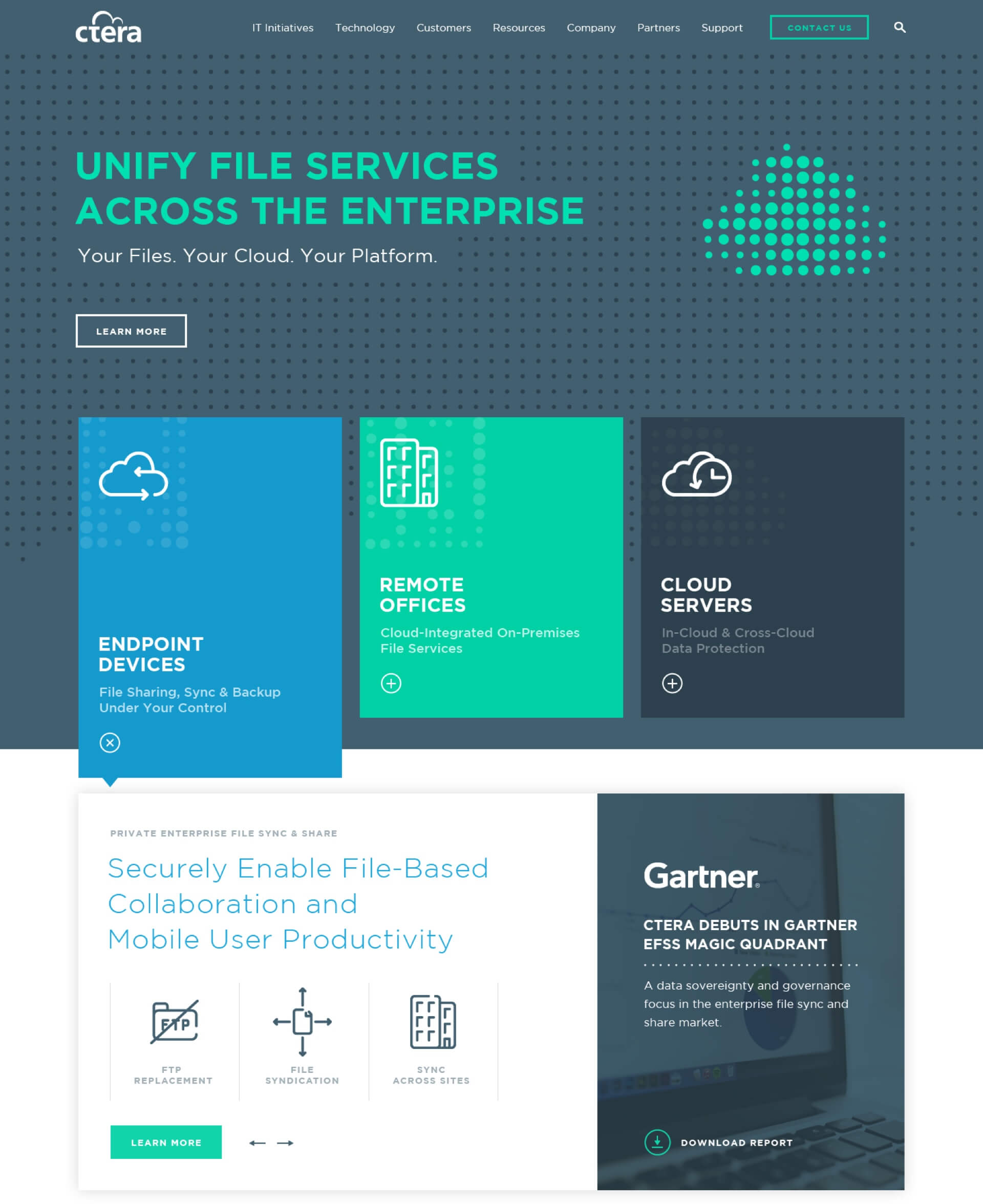
After much deliberation we determined that the most effective approach to promoting their services would be to highlight the main issues that their product solves. People resonate with their own personal pain points. They are aware of their problems and are looking for solutions. Highlighting the problem first, them following with the solution helps to ensure users that they're looking in the right spot. We worked through this concept by creating a minimally interactive experience that allowed people to easily explore further and learn more about their specific area of interest. Through the process they were offered resources and other proof points to show that CTERA was the solution they were looking for.
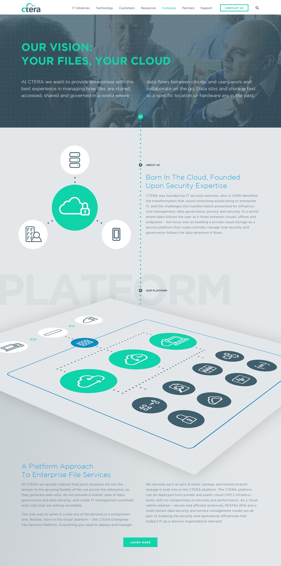
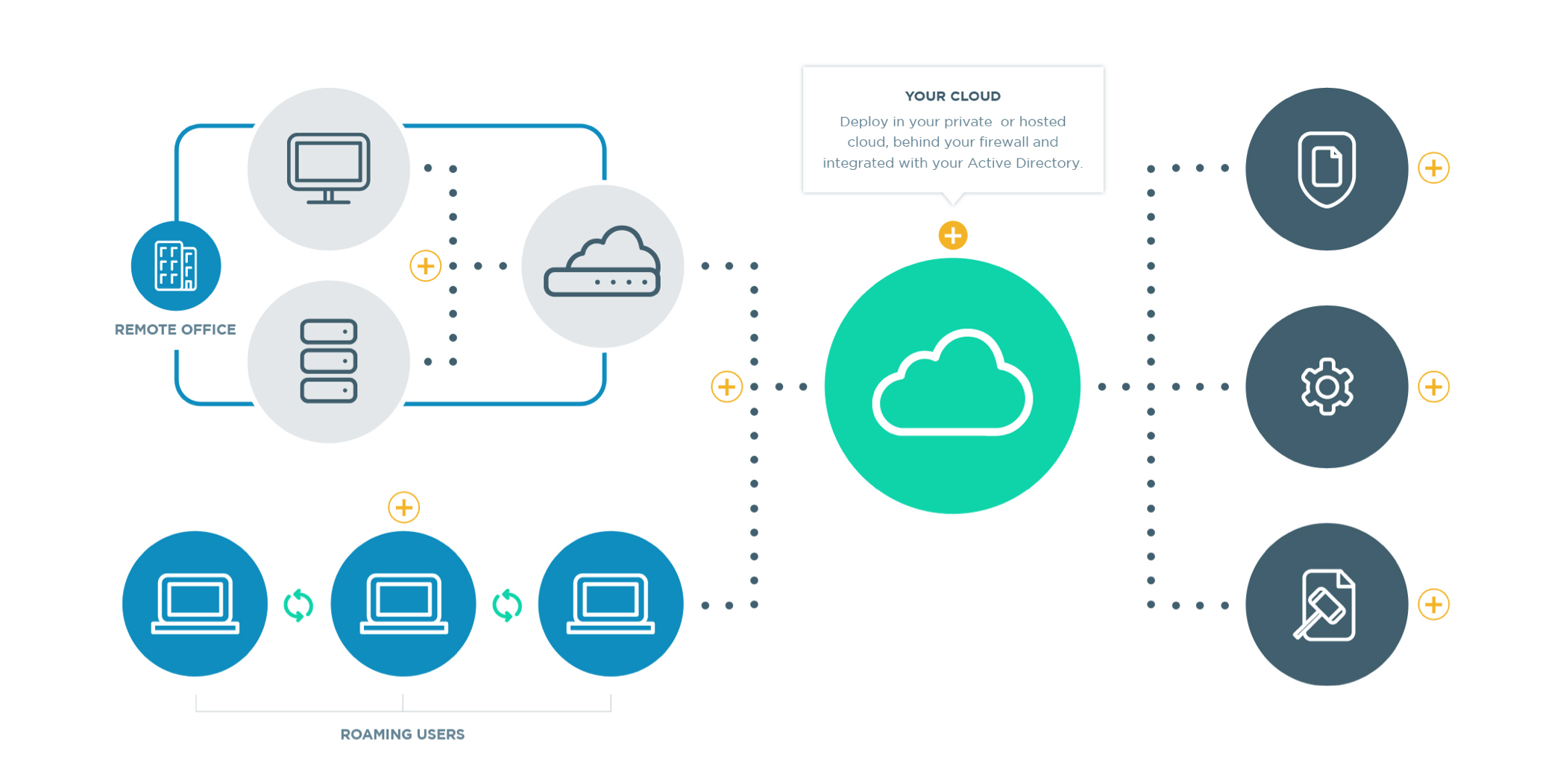
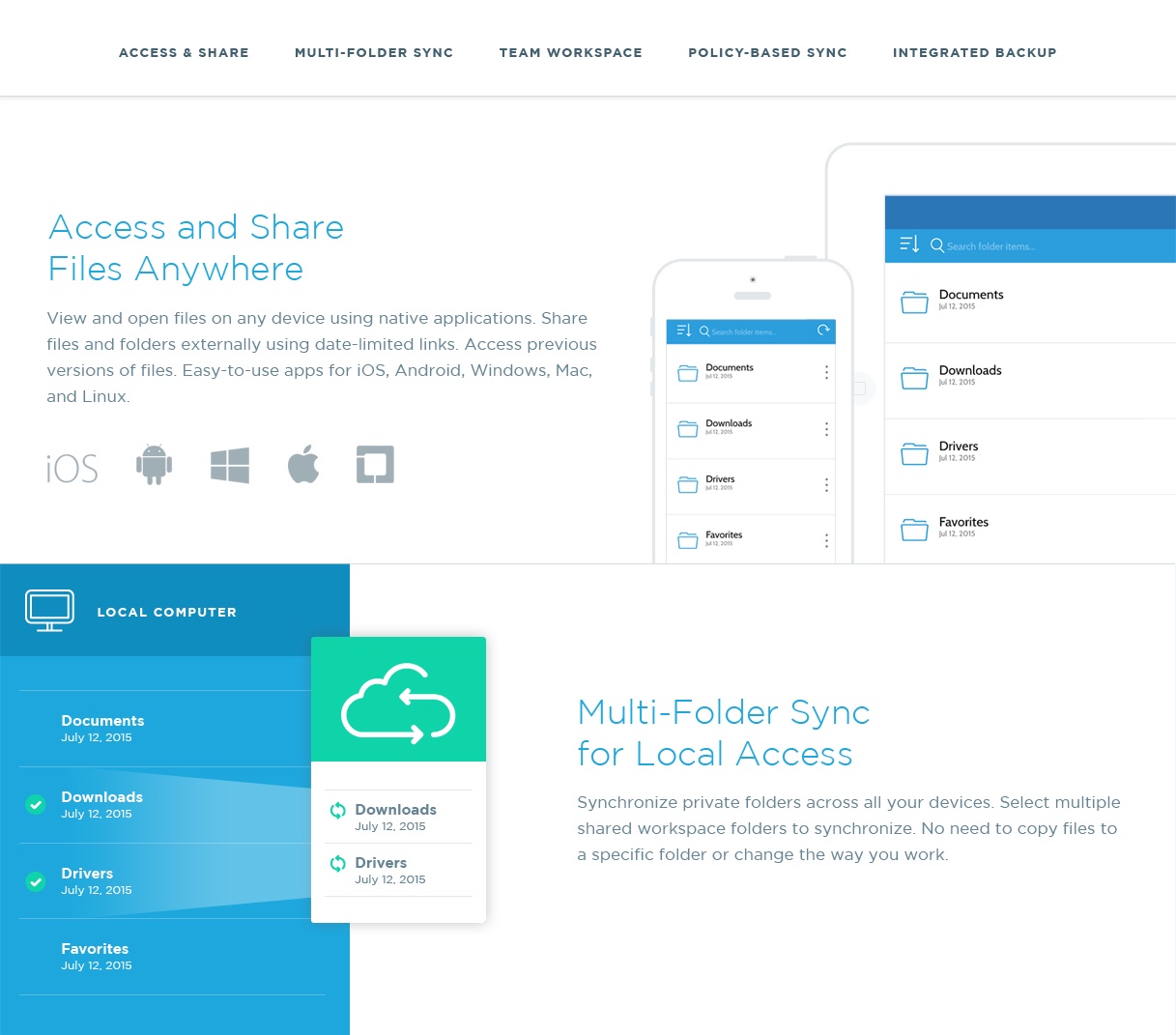
As the user continued to dive deeper into the site they would find additional information; all the way down to how everything worked from a technical standpoint. We created multiple iconic architecture diagrams to show how each individual service worked. For every relevant product/service we not only displayed the results for the end user experience, but also the admin experience. If we could describe this website in one word, it would most definitely be “thorough”.
A largely technical, content heavy site such as this may sound like it would by fairly dry to browse, but we made sure that wasn’t the case. Not only did the design feel full of life, bold, and confident, we also incorporated tasteful animations on key pages to help engage users and add to the overall level of excellence and detail that is synonymous with their brand.
This project was a pleasure to work on. Not just because of the outcome but because of the experience we had along the way. Jeff (former VP of Marketing) and his team were excellent. Fun, professional, and just as in to Seinfeld as we are.
Web
- Sitemap Creation
- Content Strategy
- Information Architecture / Wireframing
- Website Design
- Front End Development
- WordPress Development
- Responsive Development
- Hosting Consultation
- Content Migration
Branding
- Visual Web Strategy
- Architecture Diagrams
- Icon Design
Details and Depth
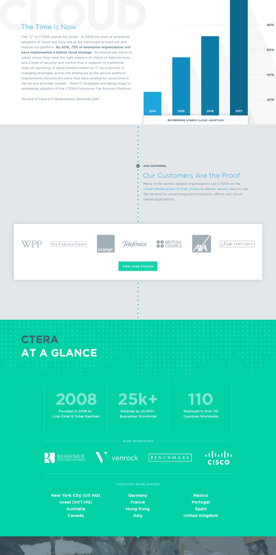
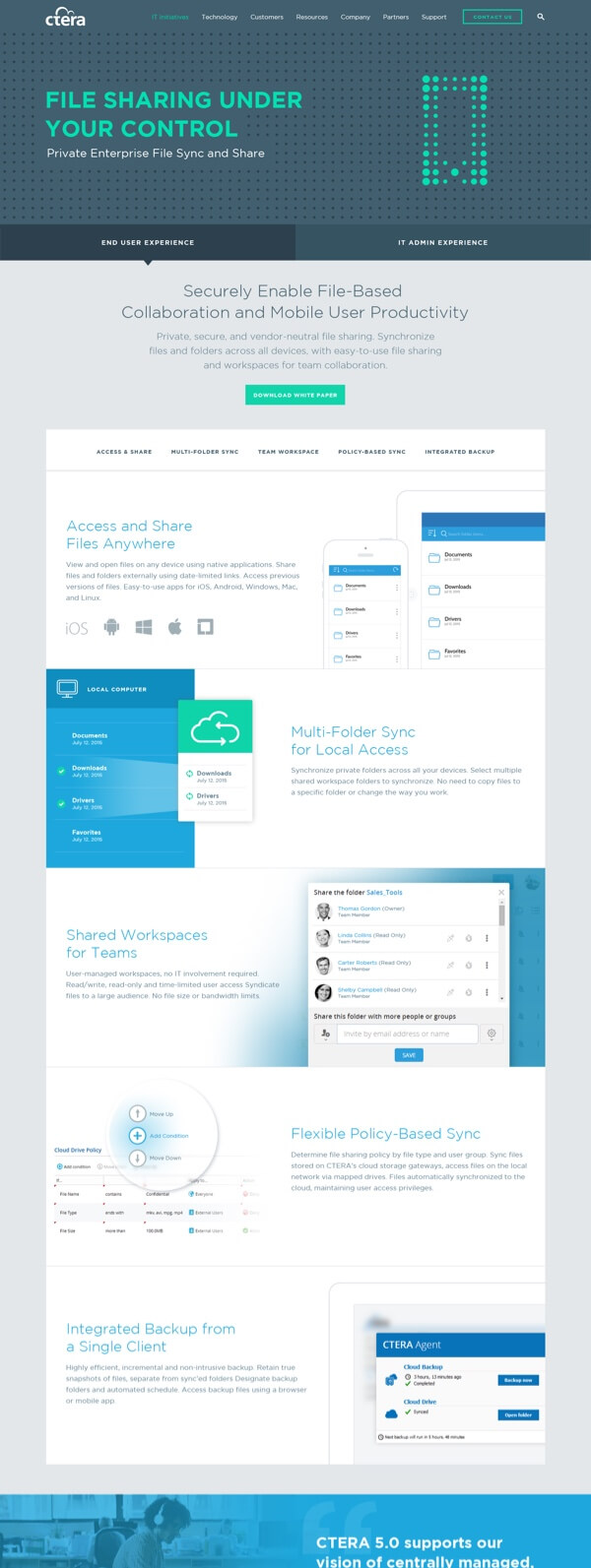
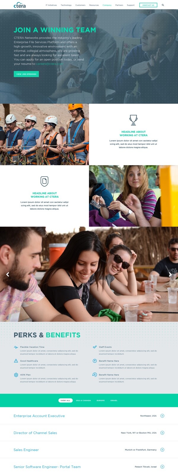
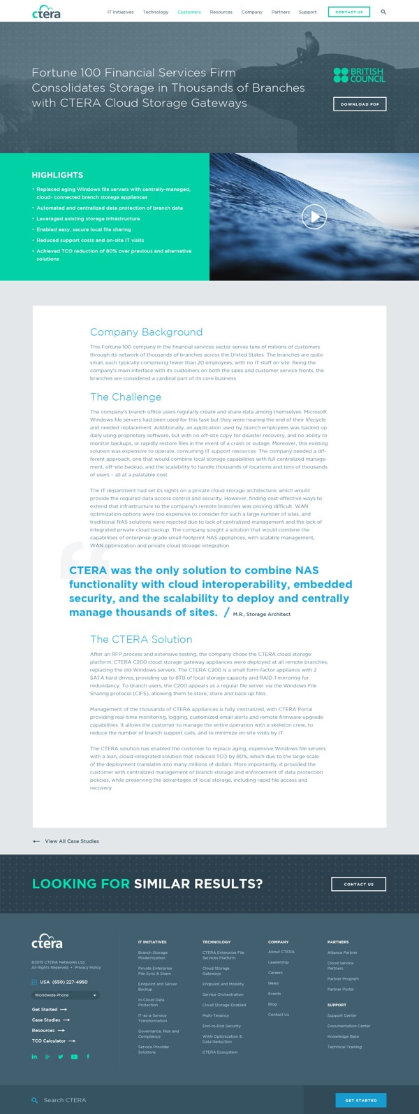
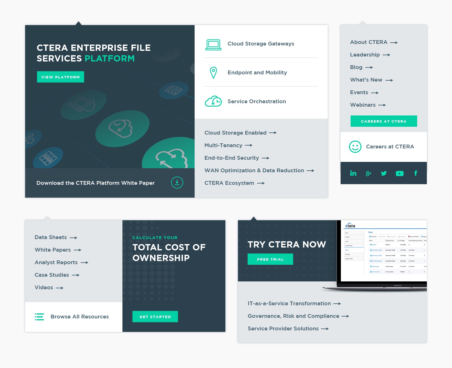
This website is expansive. Full of elaborate content and resources that are hand crafted for the best possible experience a user could ask for when diving into such a technically heavy website. Within this site you’ll find a huge variety of page layouts. Each one complete with custom supportive graphics, animations, diagrams, and interactive elements.
Optimized for Everyone
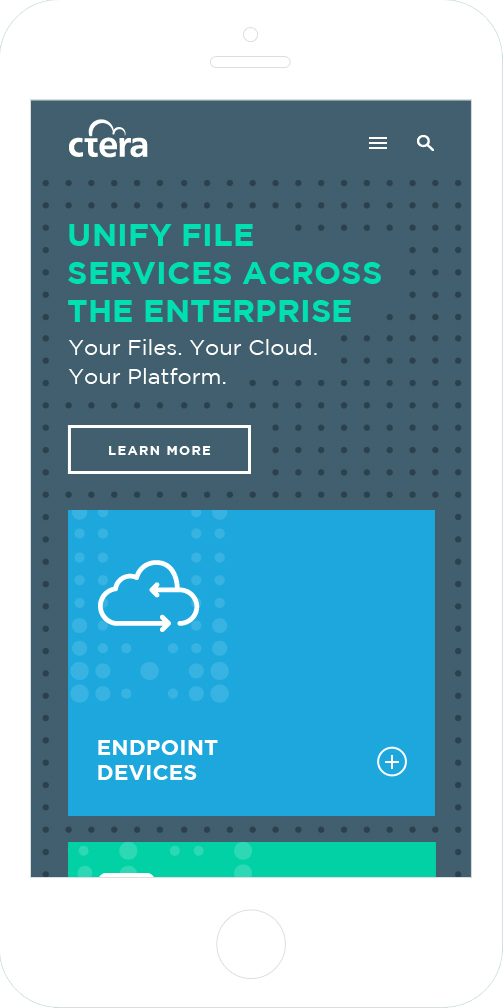
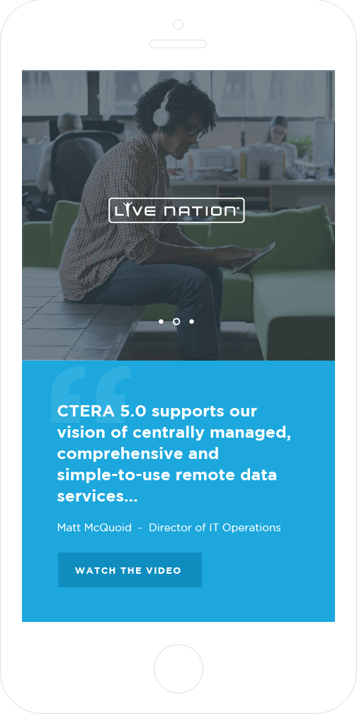
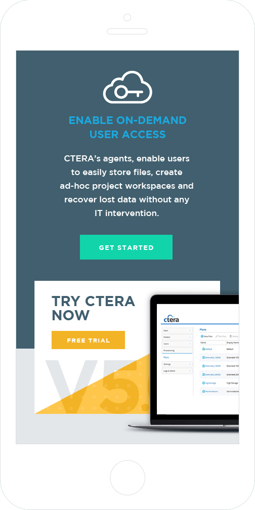
As with every Iron to Iron project, creating a completely responsive layout to accommodate all screen sizes and devices is part of our standard process. However we always pay special attention to the mobile optimization to ensure that the browsing experience feels as natural as possible.
Kevin and Jon embedded themselves as part of our team to deliver the goods. As a startup, our project naturally took a few twists and turns and ITI took all of the changes in stride. It sounds strange to say they were a great partner, only because they just felt like part of the team.
