The Challenge & Goals
They dug in quick and worked with our team to explore every option and outcome ensuring a perfect product-market fit.
When it comes to buying or selling a house, hiring a local real estate agent is typically the first step that most people take. Redefy is changing this. With Redefy you can conveniently buy or sell a home online. Plus there are some major cost benefits. However it’s a fairly new concept, not only is buying or selling a home a very sensitive experience, it can also be very complex. So in addition to needing to convince people that it will actually work the process itself needs to be intuitive and re-assuring.
Creating a user experience for an entirely new (typically complex) market that is trustworthy and intuitive is a tall order to say the least. All the while it needed to maintain an incredibly flexible layout in order to accommodate the infinite amount of variations from user to user. Having an extremely intimate knowledge of this Web application was the most critical first step we could take. This is one of the main reasons why we employ our principal of only taking on one project at a time. Without the ability to fully saturate ourselves into this project, there could have been a huge margin of error – a risk we are never willing to take.
Fully understanding the Redefy Web application required a lot of discussion, spreadsheets, and user flow tests. The process was rewarding not only because it gave us the understanding that we needed in order to move forward but it also helped uncover some new ideas for the engineers to implement, making it an all around better product.
Transitioning into wireframes was a breeze due to all of the initial effort poured into the strategy phase. It was super exciting for everyone to see how it was all beginning to take shape. The programming, logic, functionality, and user flow was all coming to life in the form of strategically placed gray boxes. The detail and thought put into the wireframe phase once again helped exposed additional areas for improvement with the user flow. As the layout evolved so did the product. Everything was really coming together.
This project contained a unique level of technical challenges. As it was mentioned above, the Web app needed to accommodate an infinite combination of layout possibilities all determined by each users unique situation. Simply put: the design had to be flexible and the development had to be incredibly agile. This may sound limiting but really it’s limits like this that help us create the best possible results. Restrictions are a reality that no project is immune to. Exposing and responding to project restrictions is the best possible way to make an honest user experience that actually works. After all, isn’t that what anybody would want for their users?
Working on the Redefy portal interface was an amazing experience. We not only enjoyed close collaboration with the Redefy marketing team but also the engineers who built the product. We learned a lot, employed some new technologies, and helped create an end product that we are truly proud of.
Web
- Sitemap Creation
- Content Strategy
- Information Architecture / Wireframing
- Website Design
- Front End Development
- Responsive Development
- Web App Development
Branding
- Visual Web Strategy
- Illustration
- Icon Design
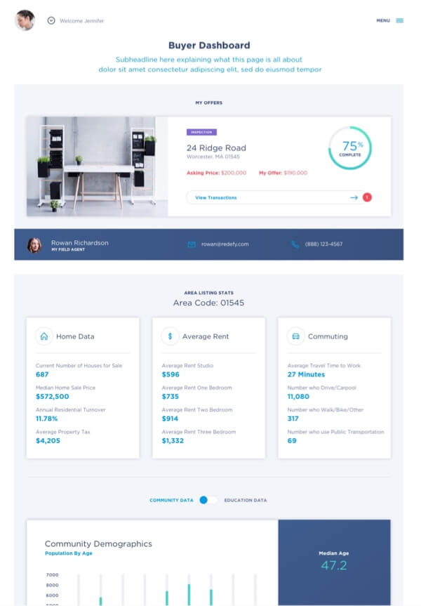
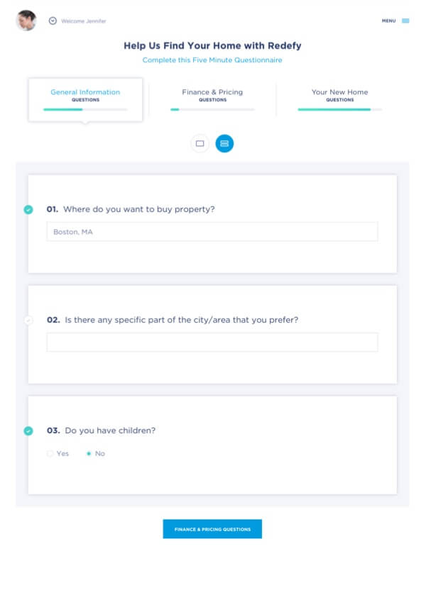
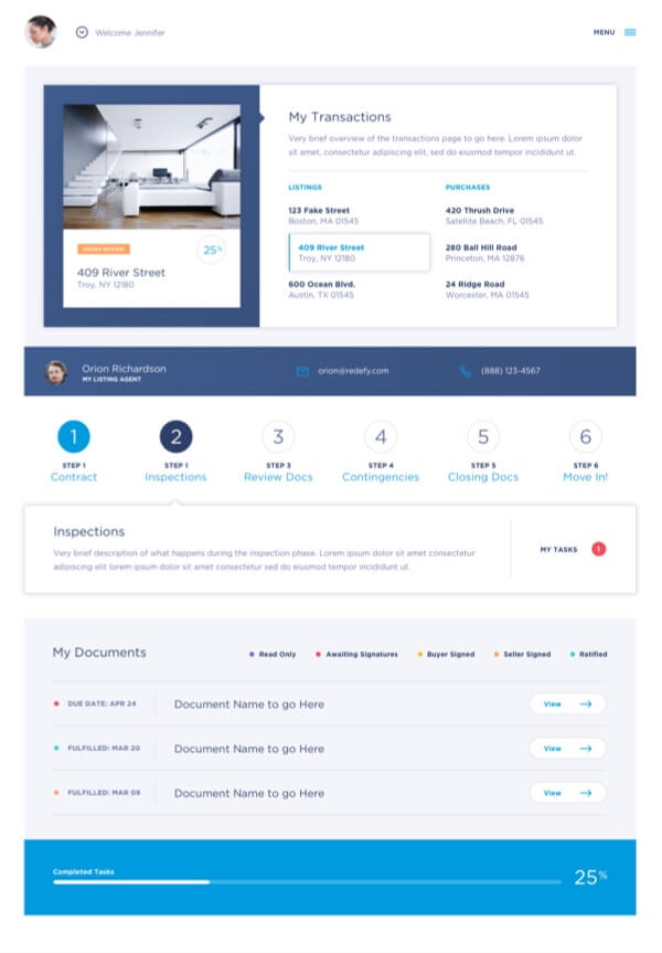
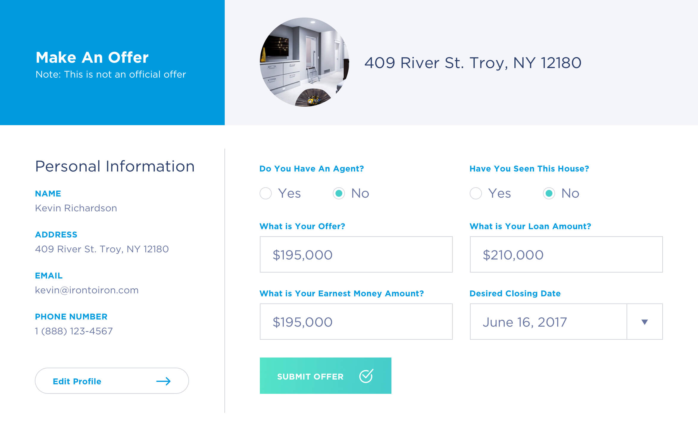


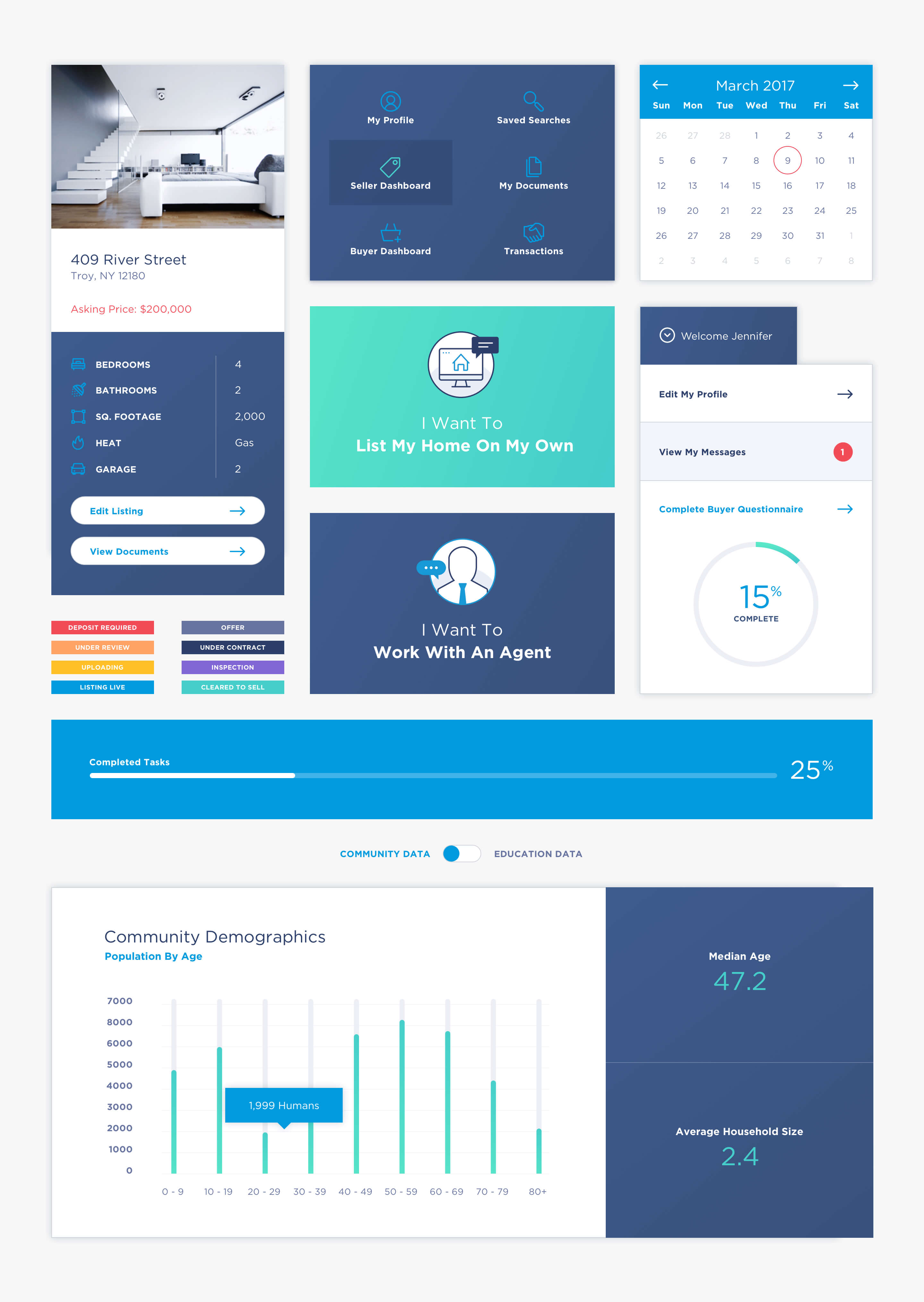
Modular Components
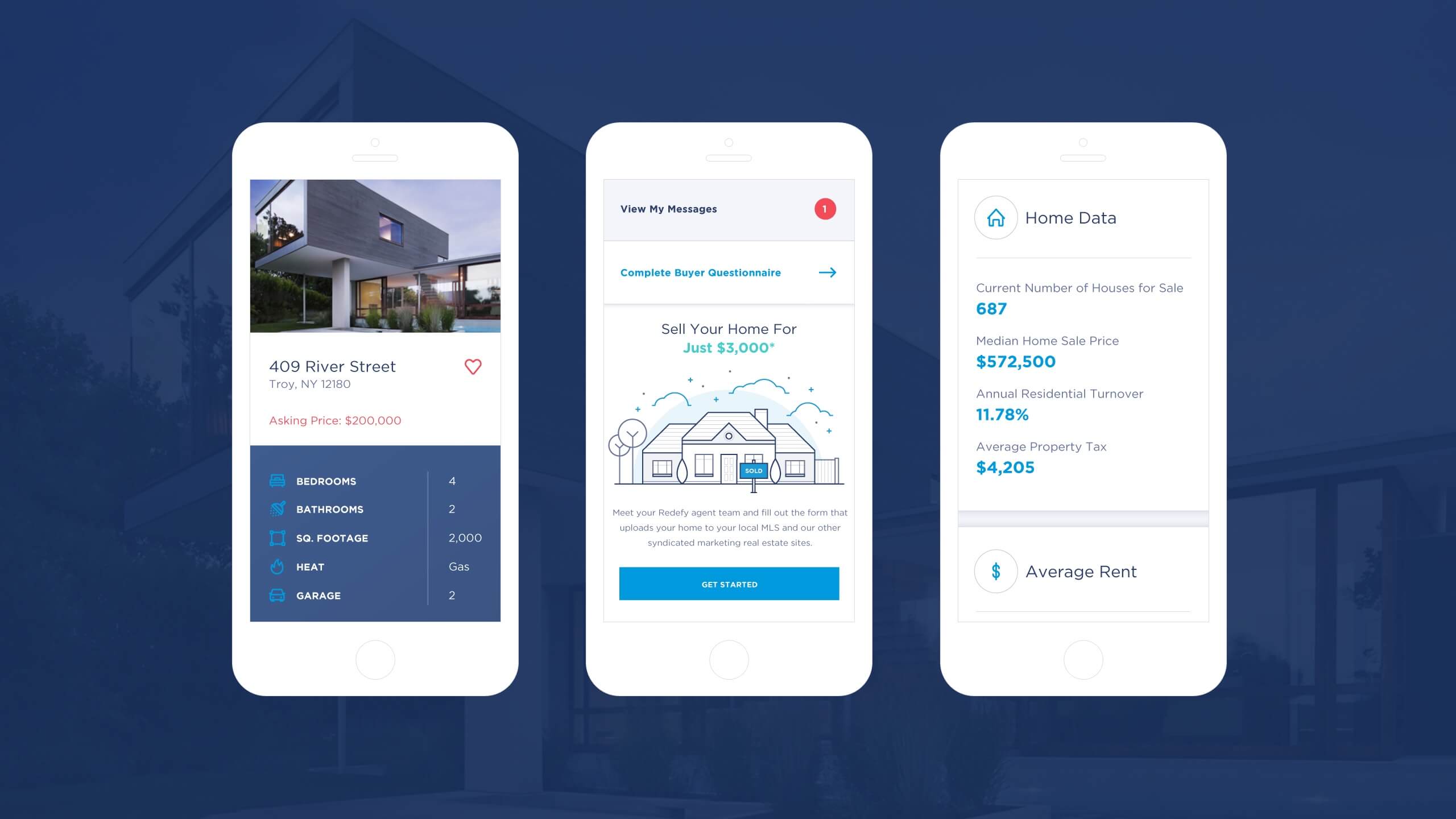
These days it’s not enough for designs to just look good and function well. They also need to respond to the respective devices that the user happens to be using. Redefy’s requirements went even further beyond these standards. Their interface needed to be completely modular. Each participating user had their own unique set of variables which required an optimized and individualized layout. Having all components be modular so that they would no only respond to devices but also to each users unique variables was a critical focal point of this project.
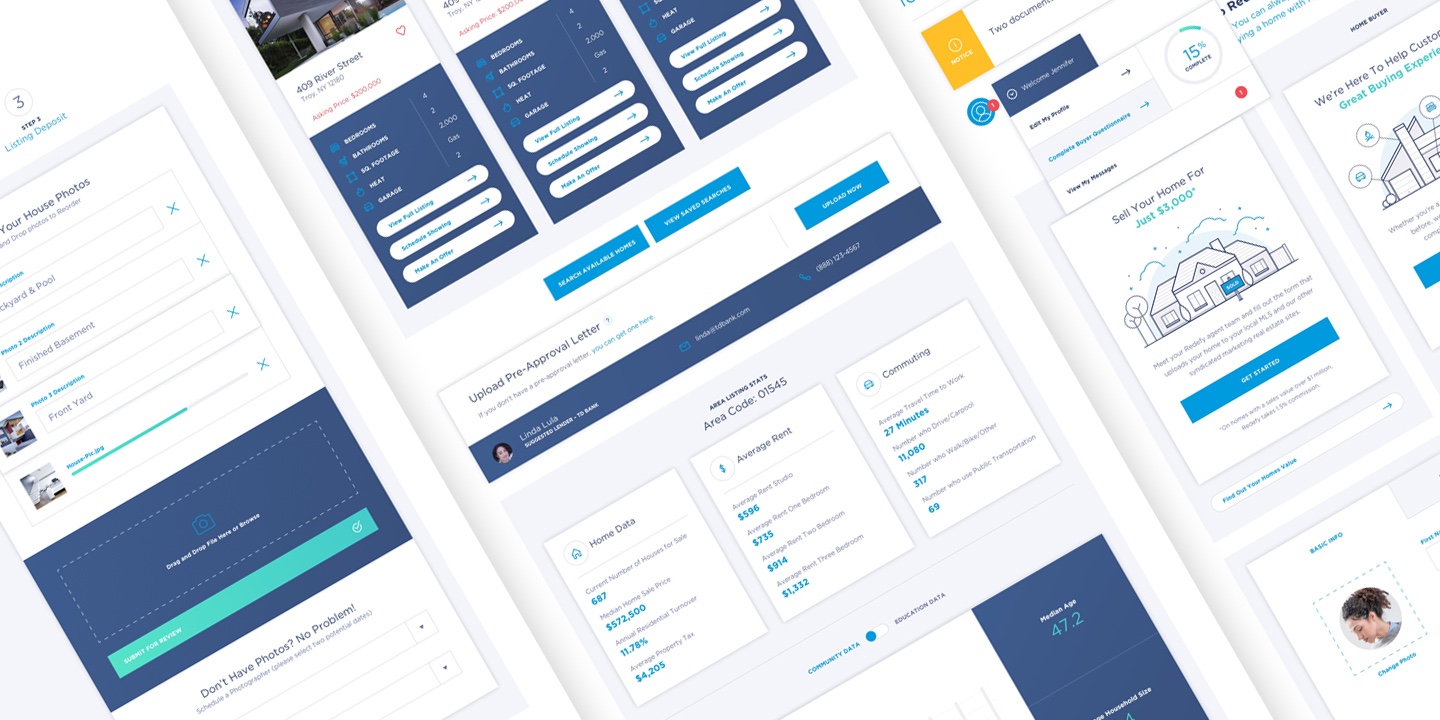
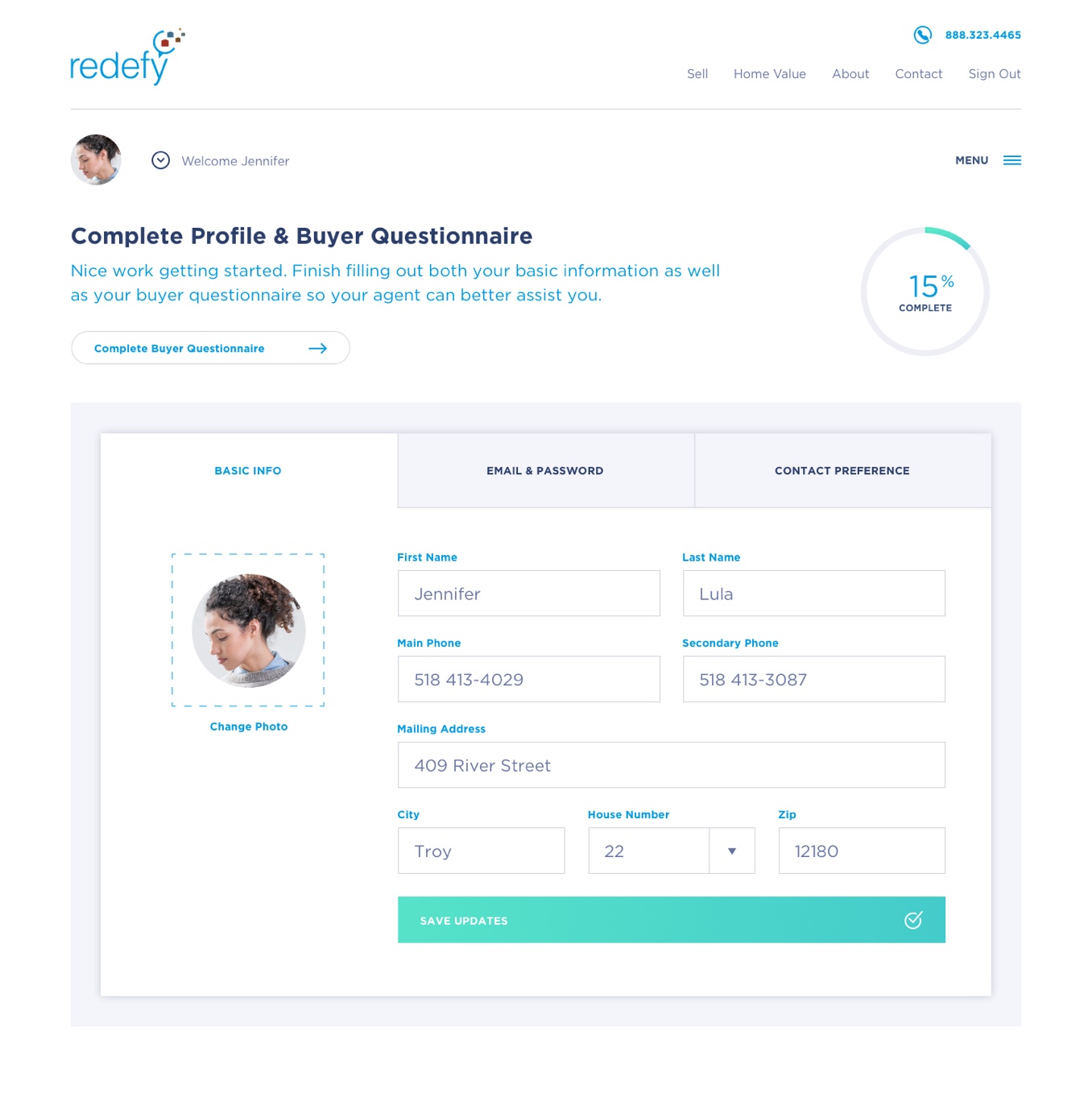
Visual Encouragement
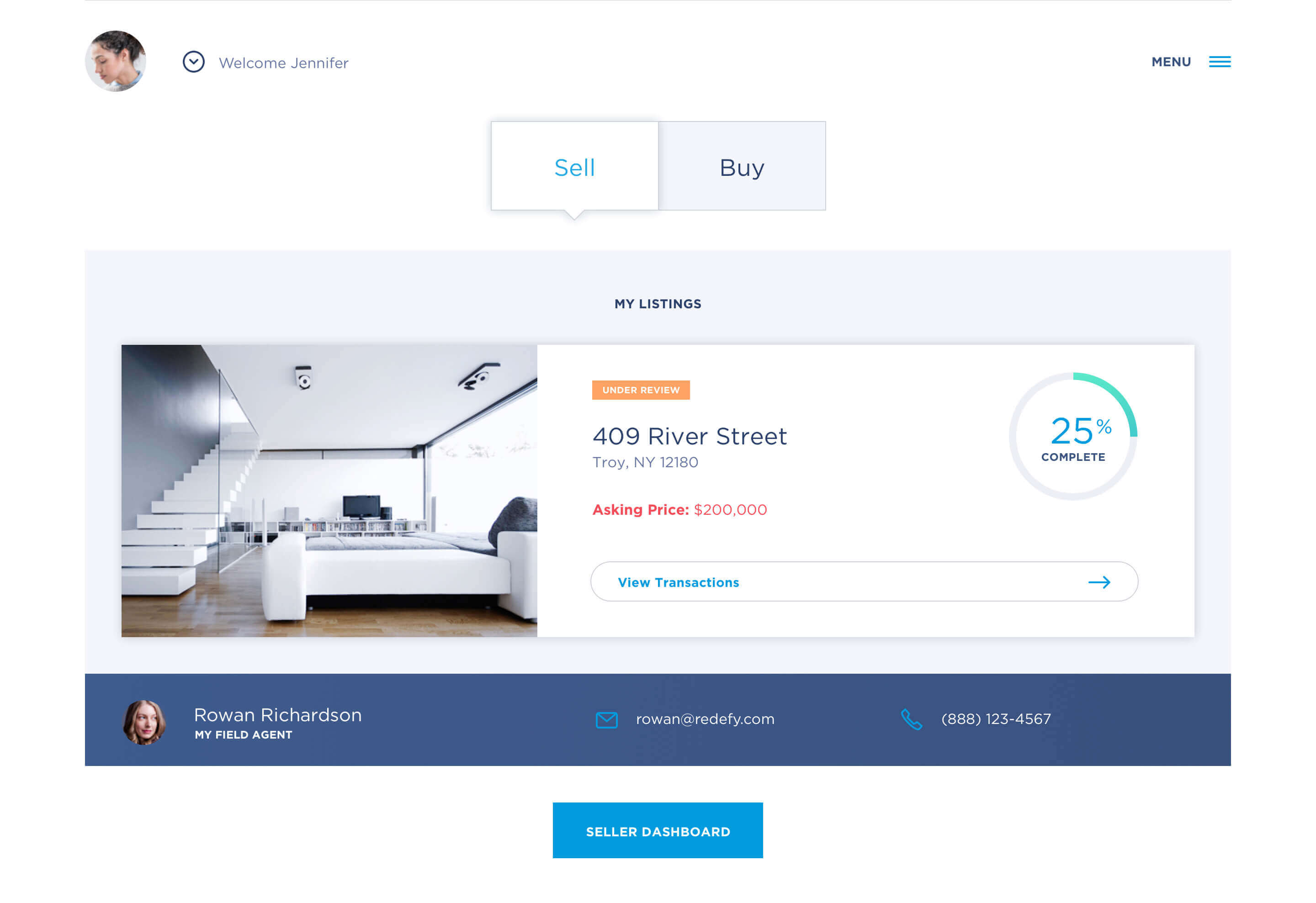
To achieve the best results with Redefy it was important that users completed relevant questionnaires and other personal information. In order to assist in this process we placed strategic calls to action throughout the site, complete with stats surrounding the amount of individual tasks that remained.
Iron to Iron was great to work with. They dug in quick and worked with our team to explore every option and outcome ensuring a perfect product-market fit. They delivered a functional and streamlined product on time and within budget.
