The Challenge & Goals
Kevin and Jonathan took the time to fully understand what market we were trying to reach…and what truly sets us apart from our competitors.
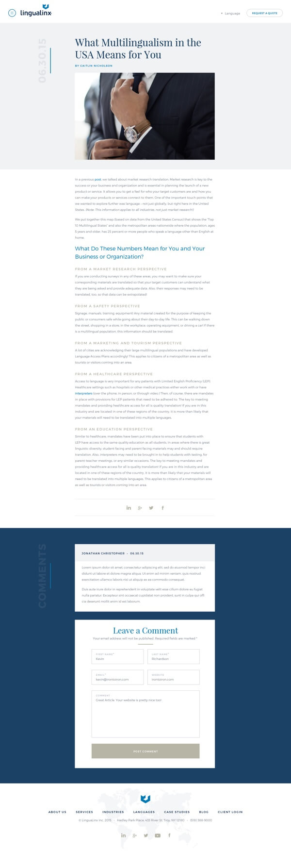
Every project has its own unique set of challenges and goals. With that, each project also contains its own unique set of solutions. Sometimes you just need to dig a little deeper to find them. When we entered the discovery phase with Lingualinx we explored many options focused on how to best communicate and showcase their services. At the heart of what they do, Lingualinx is a translation services provider, but that’s just the tip of the iceberg. We set to work considering all sorts of fun and effective ways to showcase the value and benefits that they offer.
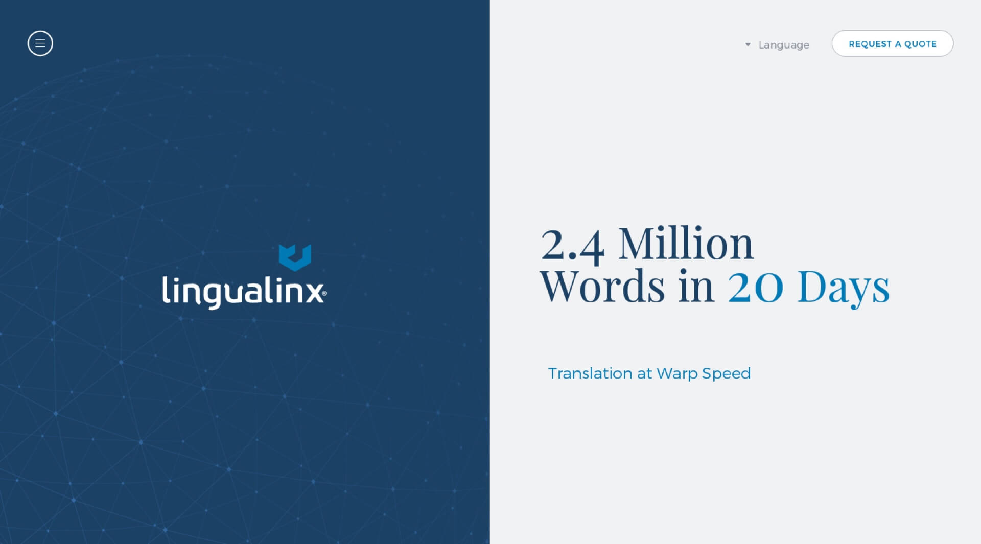
Looking for some inspiration we found ourselves reading through their case studies and there it was; the answer that we were looking for, their case studies were incredible! So powerful, so compelling! We pitched the idea of leading with the case studies as a focal point of the project. We came up with a unique homepage design that was beautifully minimal and put all of the focus on case study headlines:
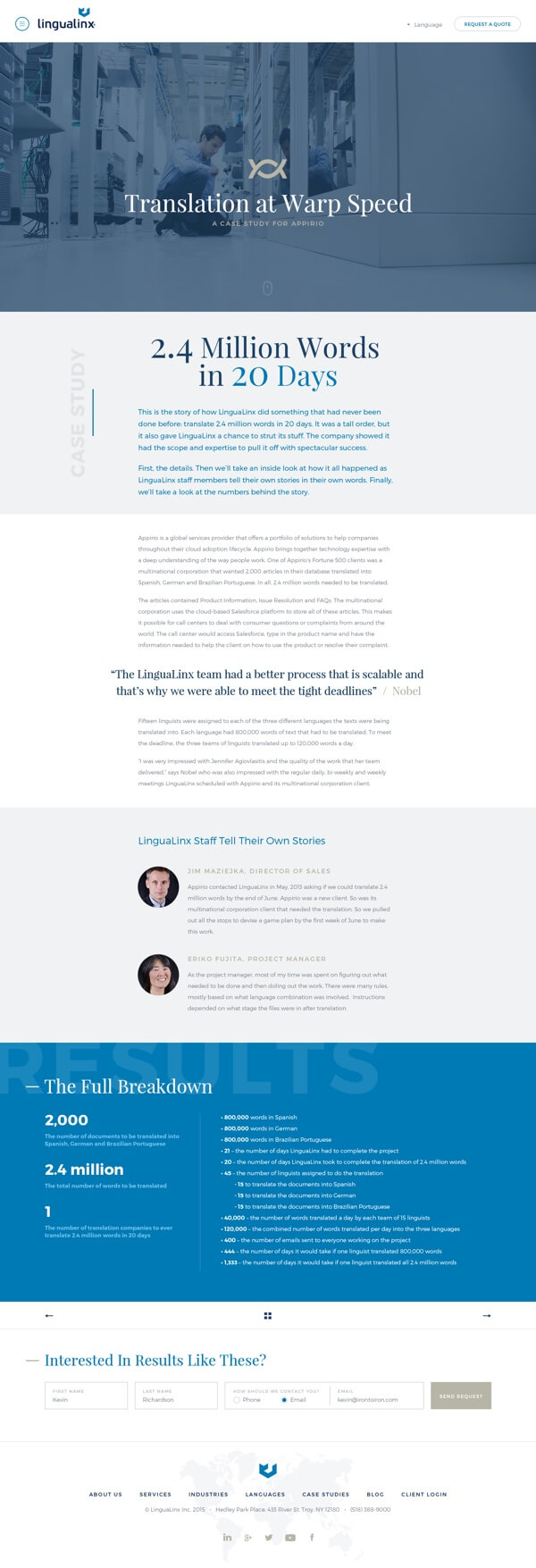
“2.4 Million Words in 20 Days – Translation at Warp Speed”
“No Need for Language Barriers – Helping a local business go global”
You have to admit it’s hard to ignore headlines like that, especially when treated in such a way that it hogs the spotlight!
The homepage includes enticing information that was well crafted and designed, but we found that getting users to click through to those case studies is what yielded the highest value. Not only are the case studies full of useful information but they’re also followed up with strategic calls-to-action to get started. This is a natural progression that anyone interested in their services would partake in.
With any project, the goal is to help the user arrive where they need to be while informing them and providing the appropriate next steps along the way. These next steps look different for each project, but once this formula has been calculated it’s only a matter of execution that outlines the success of your website. Marketing, strategy and brand management is at the core of what we provide with every project.
However it’s typically the aesthetics and seamless functionally that take all the credit for success. But that’s ok, we like that stuff too. At the end of the day though it’s not enough to just have a website that looks good. Your website needs to work for you. It needs to be your best employee. So if it’s not making your life easier, then it’s probably worth looking beyond the aesthetics and checking out the strategy that’s in place.
With the proper discovery phase, theres no reason your strategy shouldn’t be a focal point the first time around. That doesn’t mean that it should stay as is forever though. Websites should be thought of as living, breathing assets. You need to nurture them. They need to pivot with your market. This is what iteration is all about:
- Let the site do its work for a few months
- Analyze the results
- Make changes where it’s necessary
Sometimes the changes are tiny. Other times they can require a bit more re-structuring. Either way it’s a process that should be constantly cycling in order to have your website be as effective and rewarding as it possibly can be.
Web
- Sitemap Creation
- Content Strategy
- Information Architecture / Wireframing
- Website Design
- Front End Development
- WordPress Development
- Responsive Development
Branding
- Visual Web Strategy
- Icon Design

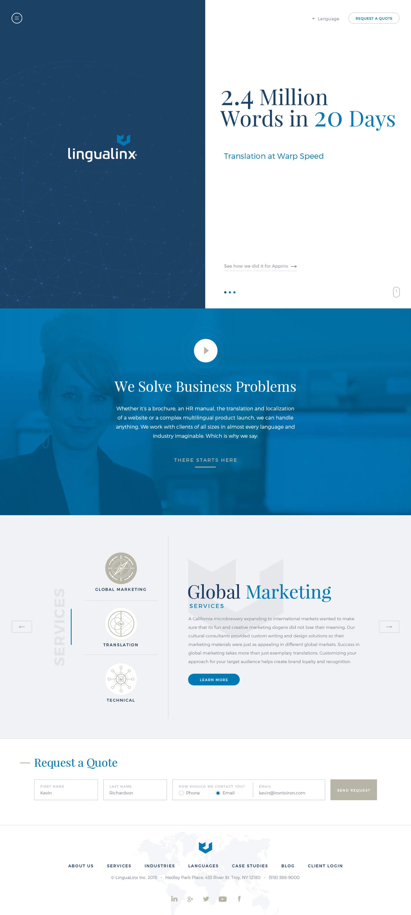
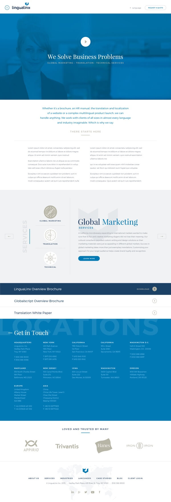
Homepage Concept
One of Lingualinx's strongest assets were their case studies. Not only are they informative but they are very engaging as well. So much so that we decided to use them as the focal point of the homepage. This split-screen style layout provided a well balanced look into the depth of their services along with solid brand recognition.
Cutting to the Chase
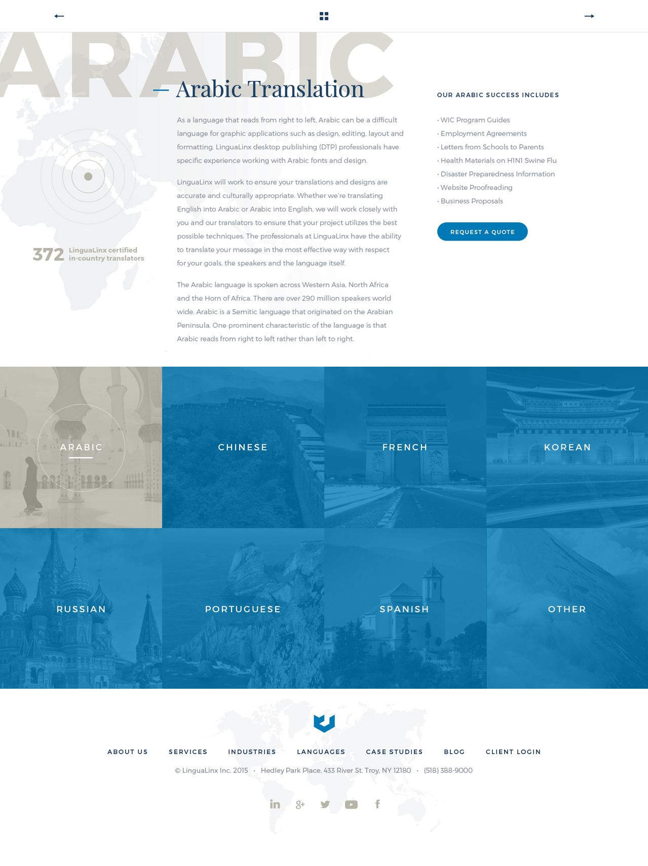
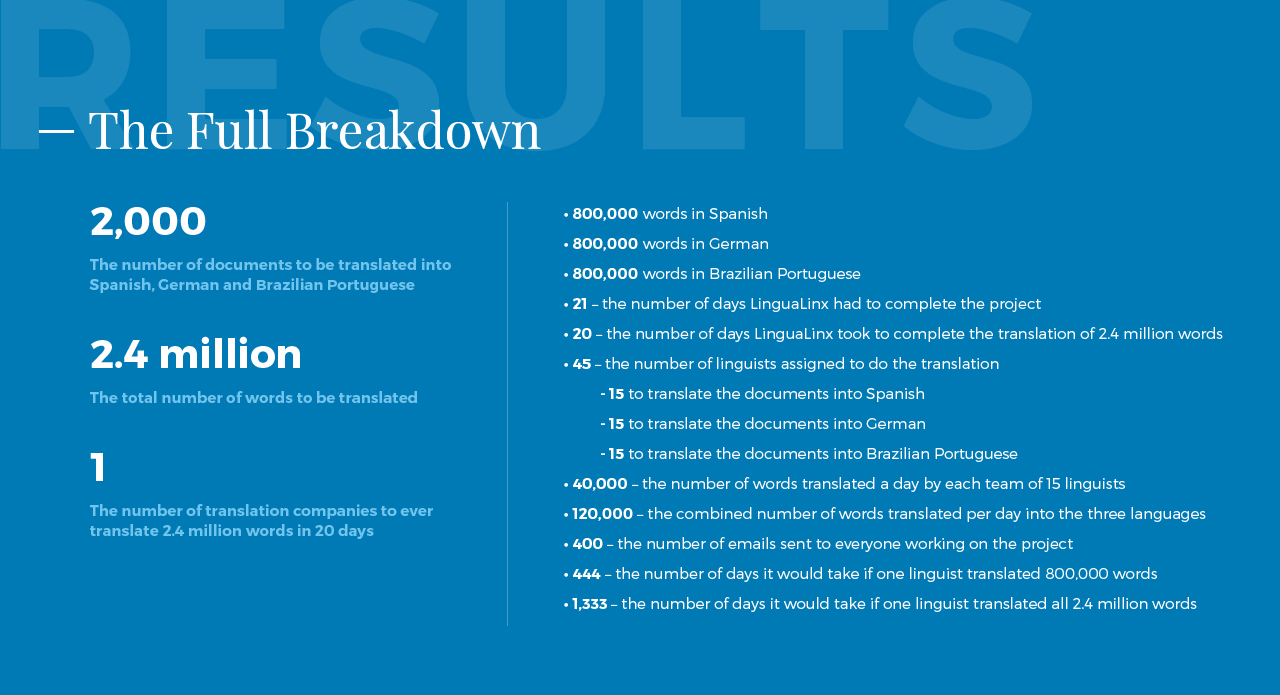
With our heavy focus on case studies, we wanted to ensure that the case studies layouts themselves were as well thought out as their content was. One particular detail that helped us accomplish this was a very straight forward “Results” section which capped off each case study. Not only did this summary provide users a quick way to see just how effective Lingualinx services are, it also functioned as the perfect encouragement for users to reach out to Lingualinx with the simple form that followed strategically afterwards.
Kevin and Jonathan took the time to fully understand what market we were trying to reach, what services we provide, and what truly sets us apart from our competitors. This crucial first step is often ignored by many developers, and I’m happy to report that ITI invested the time necessary to fully comprehend those points.
