The Challenge & Goals
Iron to Iron was a dream to work with they were creative, responsive, professional, communicative, etc. I cannot overstate the positives.
Walking into an incredibly designed and architected home or building can be absolutely mind blowing. Seeing the attention to detail, the quality of materials, the creative layouts and all of the other embellishments is nothing short of stepping into a piece of functional art. More often than not however, we fail to wrap our minds around how it all came to be. Vermont Structural Slate Company embodies this genesis.
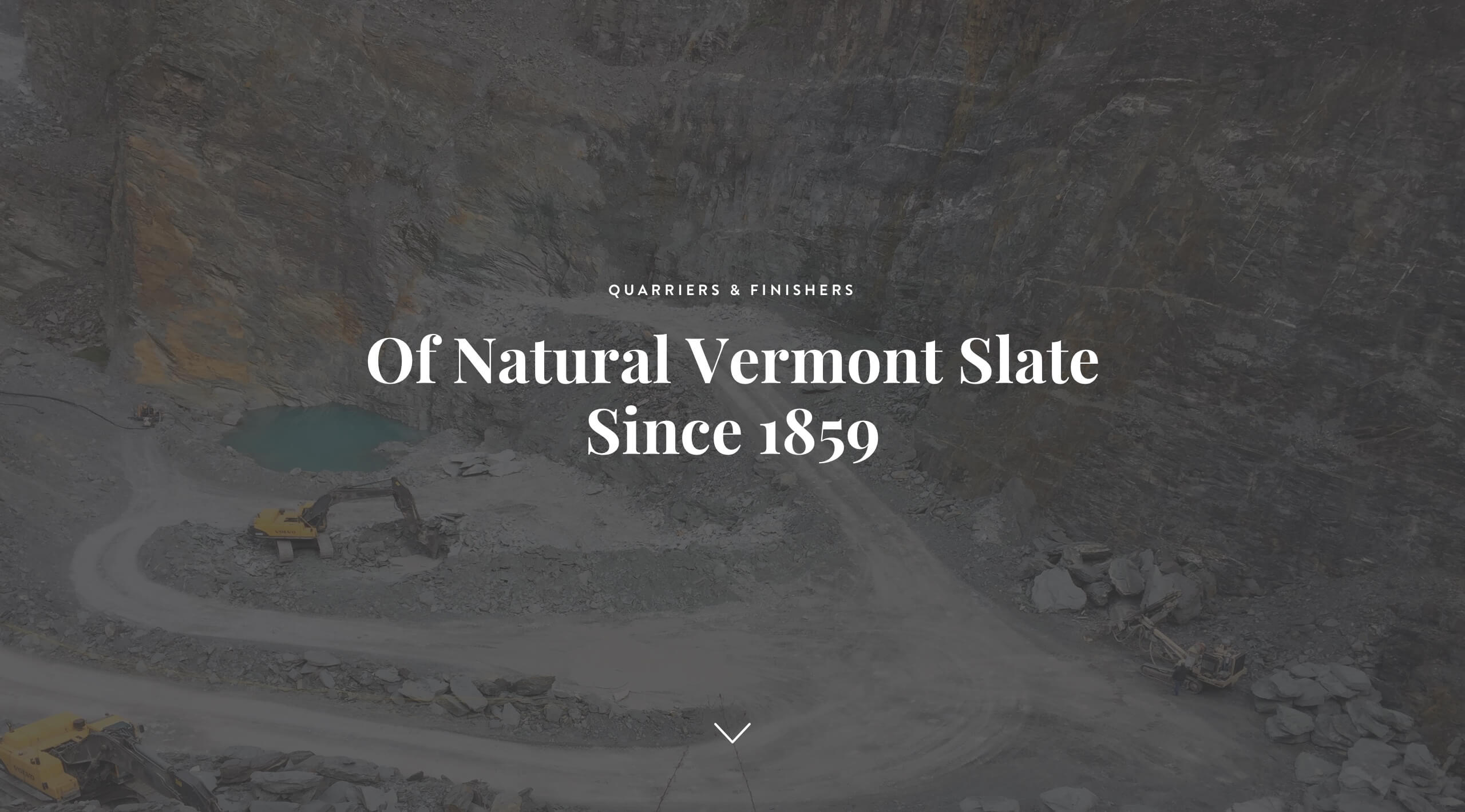
They do the hard, grueling work of quarrying natural slate from the Earth and transforming it into highly refined stone that is used in some of the most prestigious buildings and homes created. Their full narrative spans the complete spectrum.
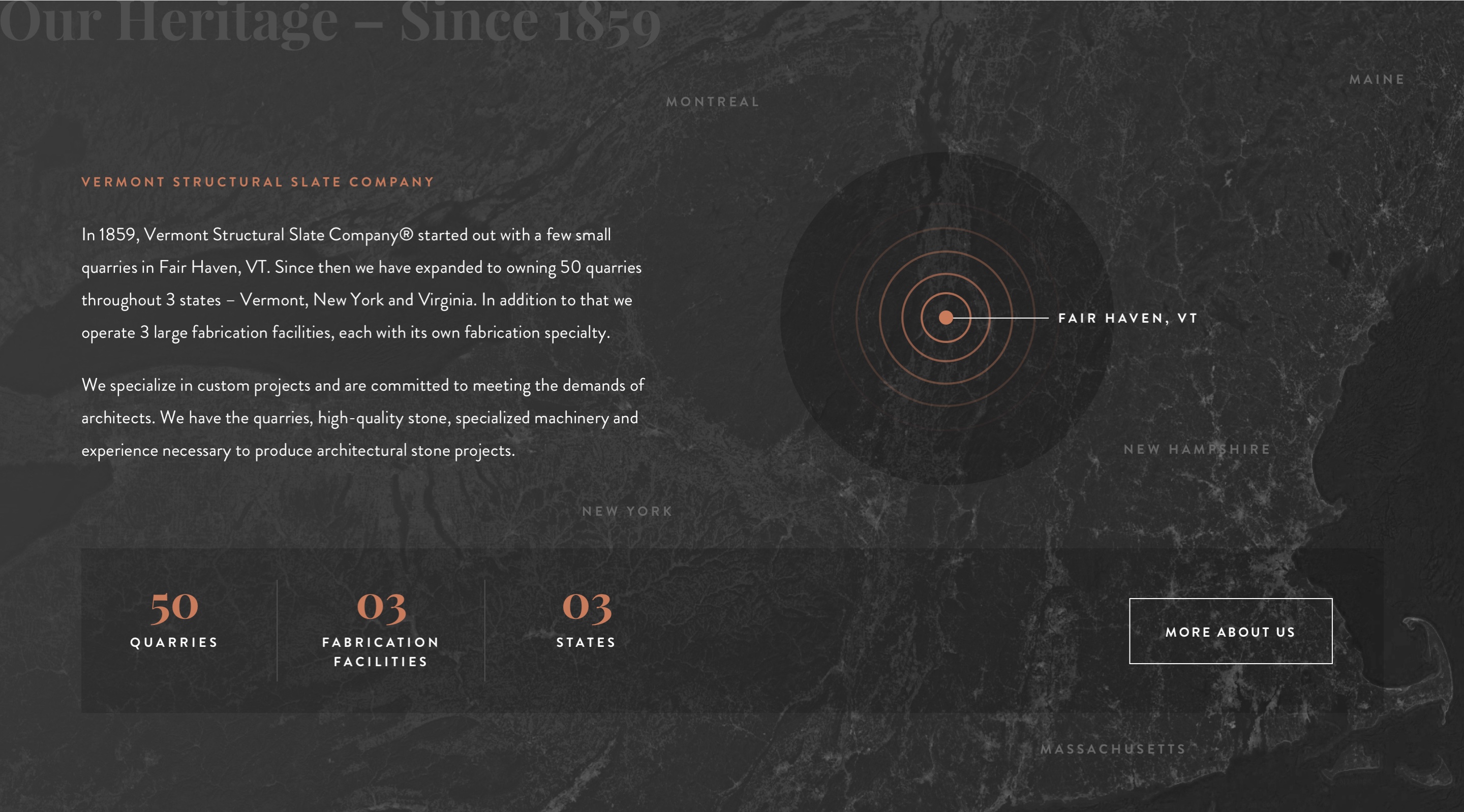
Vermont Structural Slate Company has been around for over 150 years. Their process is nailed down, and their finished products are perfected. They didn’t, however, have a digital solution that brought justice to their craft. Their existing website was utilitarian at best. It didn’t tell the story of how their product was created nor did it fully utilize the potential of just how impressive it is in a finished state. It was our job to fix this.
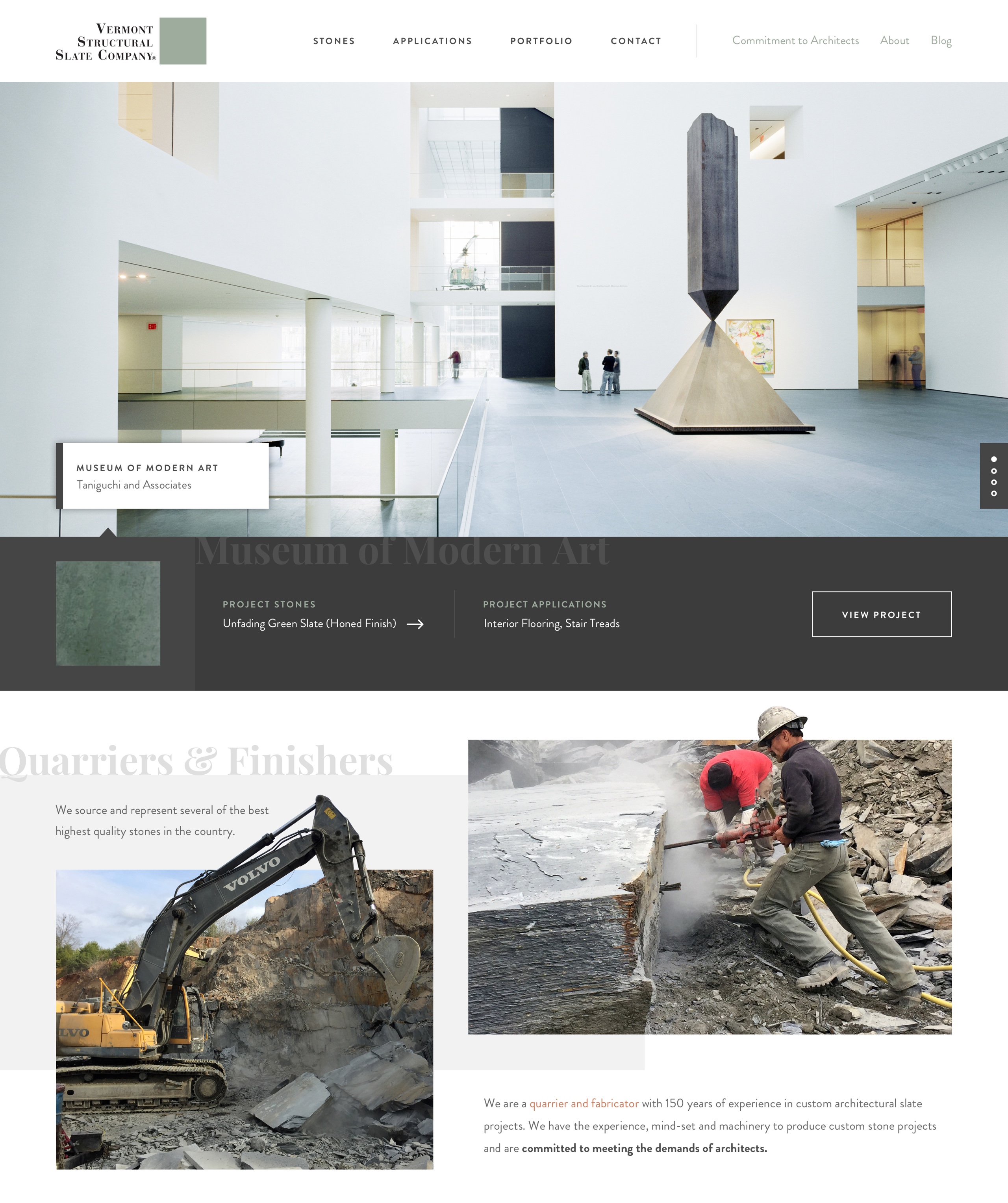
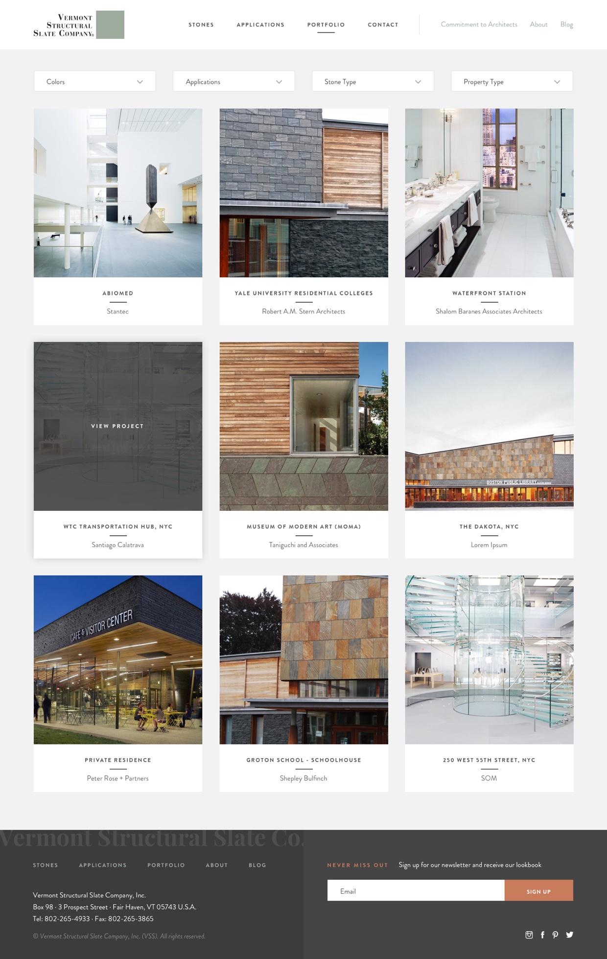
The site design needed to be clean and modern in order to appeal to Architects as the primary target, while also remaining true to the ruggedness of the Quarrying Industry. At its core, the site is a highly comprehensive gallery of work that intuitively provides details about each application and stone being used. It provides an experience for its users that is both engaging and informational. Honestly, you could click around for hours and not get bored.
Browsing through this website now gives the user an appreciation for the entire process and displays the depths of their capabilities. It is organized in such a way that an architect would never be left in question. Rather, it shows that Vermont Structural Slate Company is the leader in this industry and provides the products and services necessary to truly create a functional piece of art.
Web
- Sitemap Creation
- Content Strategy
- Information Architecture / Wireframing
- Website Design
- Front End Development
- WordPress Development
- Responsive Development
- Hosting Consultation
- Content Migration
Branding
- Visual Web Strategy

Content Organization
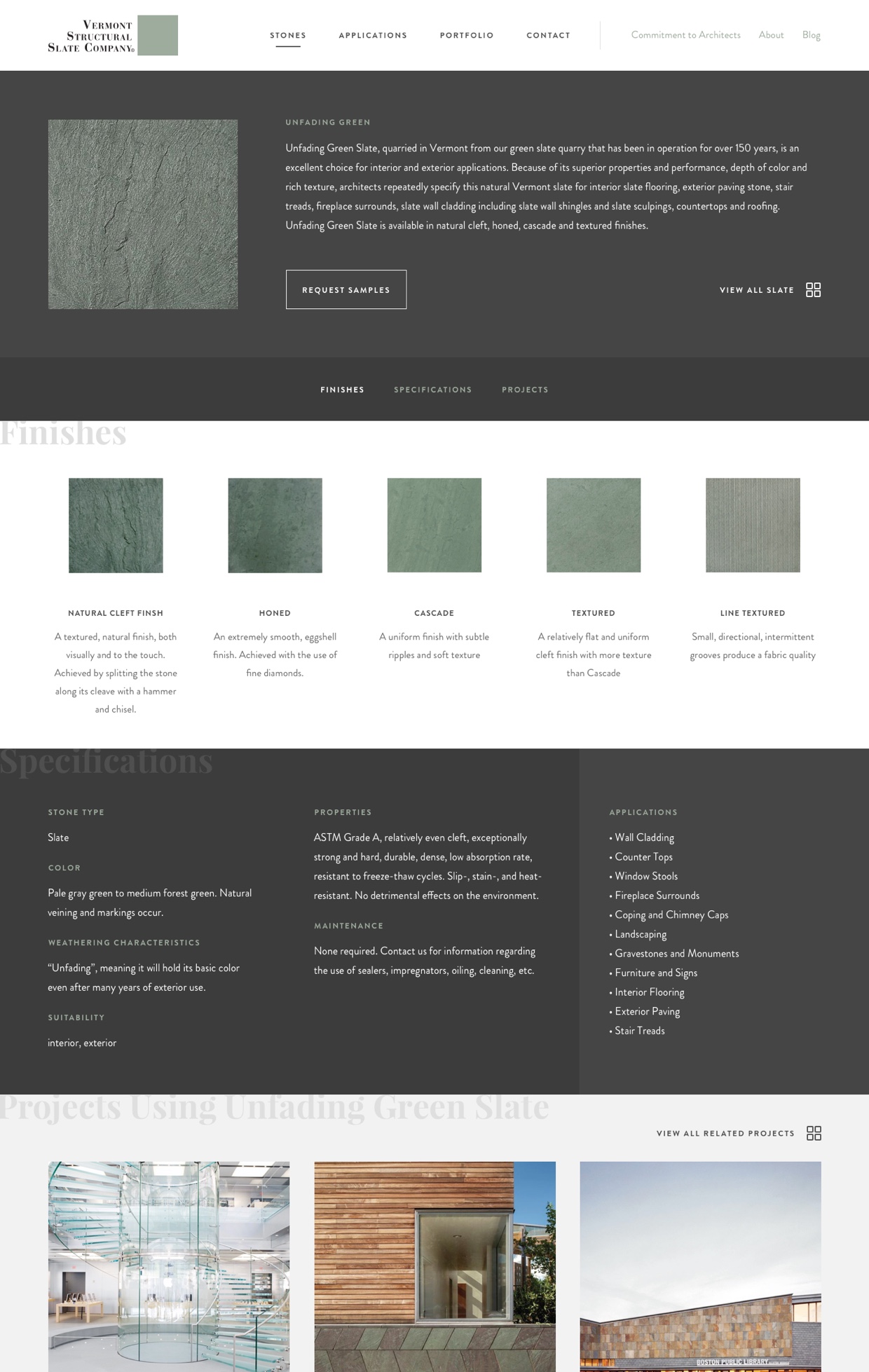
The organization of this website was critical to its success. Users can find information on stones from a variety of avenues. Browsing by "Application" is one particular example. Each application contains its on unique specifications, availability and examples. This allows the user to select the right stone(s) for their project.
The Finished Product
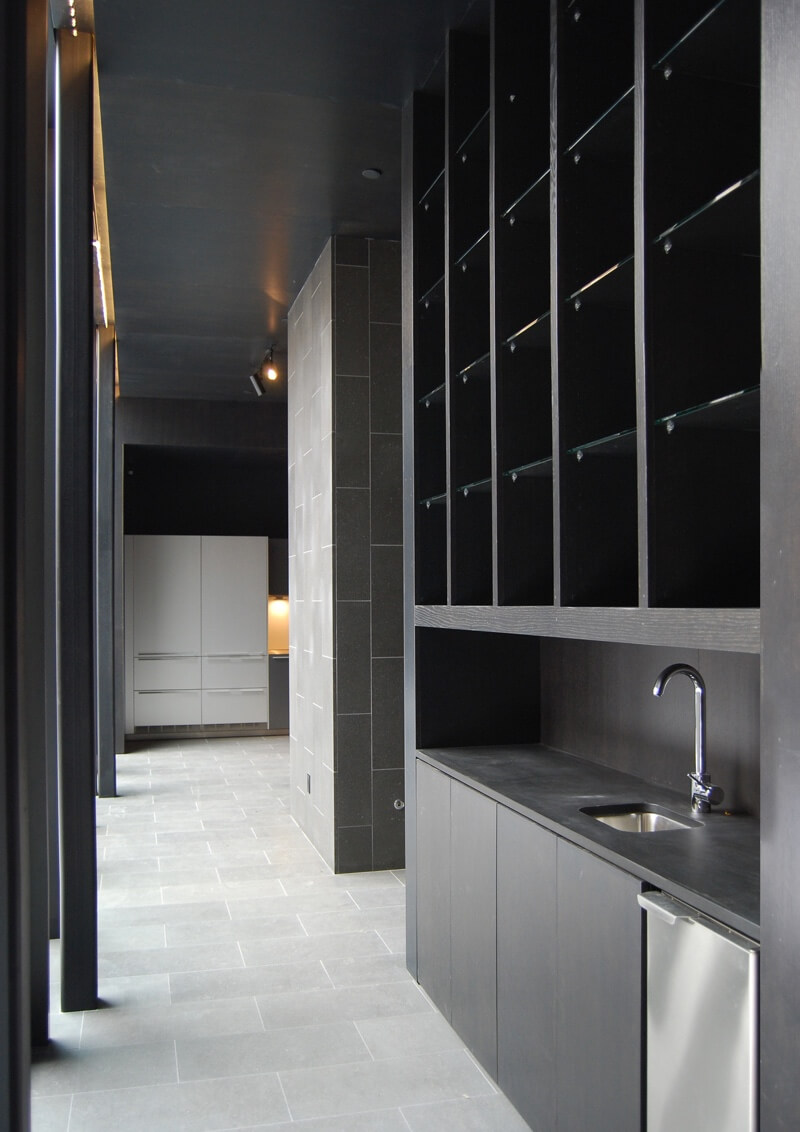
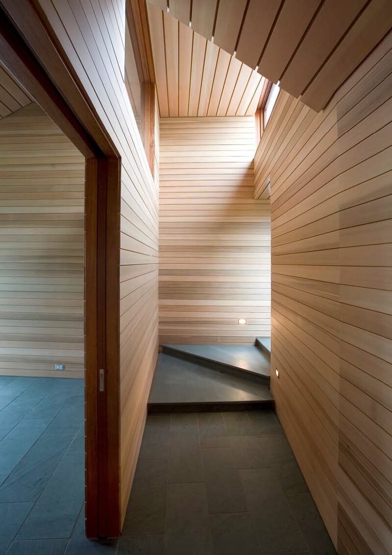
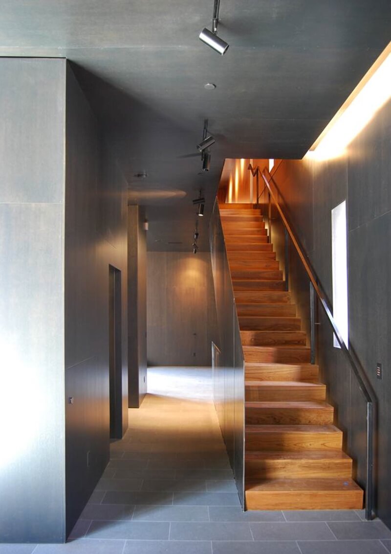
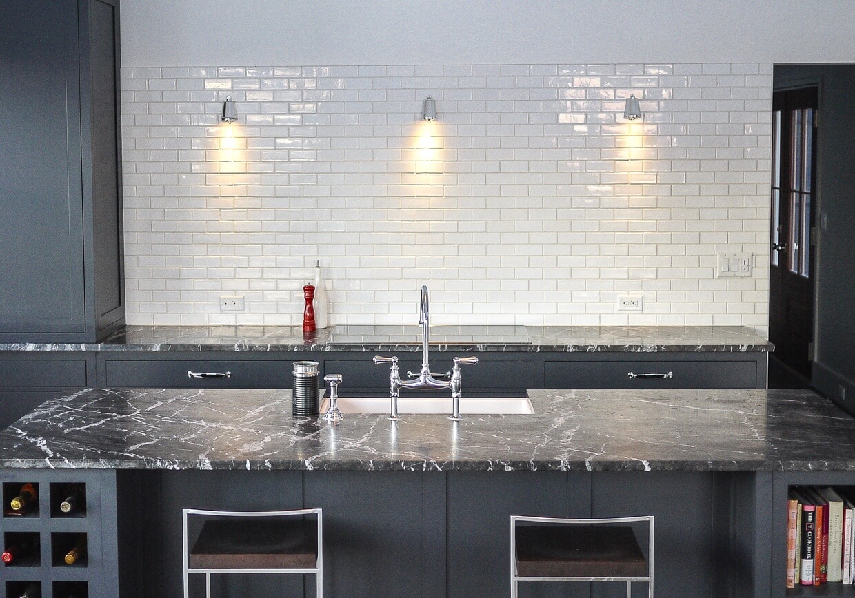
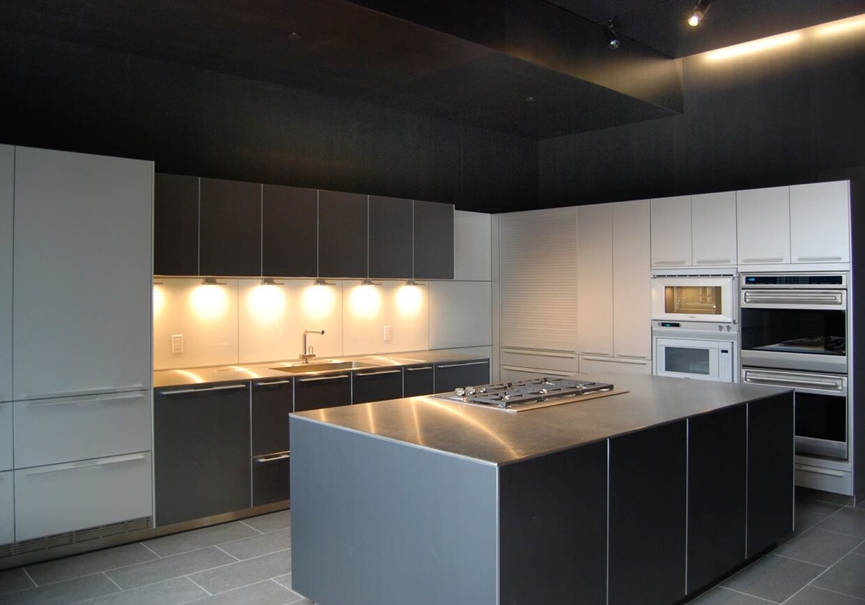
This site was intentionally focused around not only the process of Quarrying, but the final outcome. It is an extremely thorough gallery of amazingly beautiful homes and buildings. We couldn't help but to share a few of our favorites here.
Iron to Iron was a dream to work with. From the initial concept meeting to the launch of our website, they were creative, responsive, professional, communicative, etc. I cannot overstate the positives. I am very detail-oriented and have launched several websites and, although this was the largest site I have done, it was also the smoothest process. Their creativity, combined with solid judgement about practicality, yielded an intuitively layered yet clear and concise website that will serve us for decades to come.
